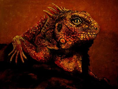
Monochromatic colors are all the colors (tints, tones, and shades) of a single hue.

Monochromatic color schemes are derived from a single base hue and extended using its shades, tones and tints. Tints are achieved by adding white and shades and tones are achieved by adding a darker color, gray or black.
Monochromatic color schemes provide opportunities in art and visual communications design as they allow for a greater range of contrasting tones that can be used to attract attention, create focus and support legibility.
The use of a monochromatic color provides a strong sense of visual cohesion and can help support communication objectives through the use of connotative color. The relative absence of hue contrast can be offset by variations in tone and the addition of texture.[1]

Negative space, in art, is the space around and between the subject(s) of an image. Negative space may be most evident when the space around a subject, not the subject itself, forms an interesting or artistically relevant shape, and such space occasionally is used to artistic effect as the "real" subject of an image.
The use of negative space is a key element of artistic composition. The Japanese word "ma" is sometimes used for this concept, for example in garden design.[1][2][3
In a two-tone, black-and-white image, a subject is normally depicted in black and the space around it is left blank (white), thereby forming a silhouette of the subject. Reversing the tones so that the space around the subject is printed black and the subject itself is left blank, however, causes the negative space to be apparent as it forms shapes around the subject. This is called figure-ground reversal.


No comments:
Post a Comment